About
MiTravel is a virtual planning board for travel enthusiasts and avid planners to collaboratively plan and visualize their best trips together.

Overview

Savneet S. • Group trip planner
“MiTravel provides a simple, intuitive planning board to plan out your trip with friends. I tested out their application by planning out a small trip. It was easy to create activities, polls and notes to share with trip attendees.”
How it started
As a co-founder and lead designer, I led a team of 5 designers and collaborated closely with the development team & business team to shape the vision & tangible form of the product.
We had around 1000+ active users without doing any marketing at all at some point and then we all wanted to focus on other stuff so we just stopped :D
.png)
Carlinda L. • Family trip planner
“As my family’s travel planner, I’m super excited about the MiTravel Planning Board after seeing all its features! Not only does it allow you to collaboratively plan your must-see destinations, conveniently see it all on a map, and view your finalized trip on a holistic timeline, but it's aesthetically pleasing too.”
.png)
David A. • Group trip planner
“I am excited to use the MiTravel Planning Board since I can collaborate with friends to create memorable adventures. The board has a sleek design and a user-friendly interface. I enjoyed how we can filter the planning cards and add a variety of information to study our destinations beforehand.”
The “initial goal”
I was brought in to make MiTravel’s initial MVP more user-friendly.
But the problem is...
-
No feature is fully fleshed out.
-
Very limited resources: time, talent, finance.
-
Hard to compete with other established products.
Our process
I proposed re-scale & re-scope. I advocated for us to take on a customer-centric & data-driven approach for the product development process. Our product strategy was largely influenced by the insights collected from our research on user needs throughout and after the pandemic.

1 • Research & Discovery
Collaboration in travel planning
Market research:
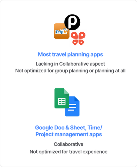
Collaboration in trip planning was lacking
We reviewed popular travel apps like Pebble, Wanderlog, and Google Trips, and found that while they handled itineraries well, collaboration was often missing. That became a key focus for MiTravel. We also looked at note-taking & collaborative tools since many users were already using them for trip planning.

250+ surveys:
Find common pain points
We conducted around 250+ surveys with travel hobbyists, travel influencers & digital nomads all over the world about their trip planning process & pain points.

50+ qualitative interviews:
Different types of travelers
To gather more detailed insights, with my team, I interviewed around 50 experienced group and solo travel planners to get a better understanding of their planning process, preferences, & pain points.
Insights: the different types of travelers

Within our main targeted customer segment - Travel Hobbyist, we identified 2 main types of travel planners. Group travelers prefer a detailed and organized plan (tend to plan for group travel), while solo travelers prefer a more flexible approach to planning.

2 • Strategy & Ideation
Design for constraints
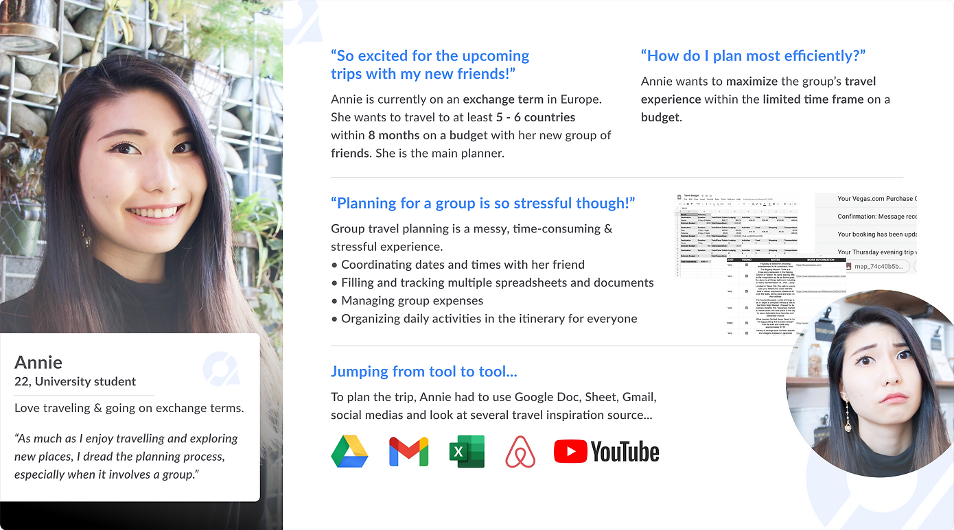
We focused on the Exchange student user group because of their intensive travel planning needs and lots of tight constraints to work with. With the Exchange student persona, we were then able to identify the important features for each of the user categories, which made it easier to prioritize features for early development later on.
Scope & prioritize
“How might we create an exciting, stress-free, effective trip planning process for our users?”
Our initial framing helped us nail down the very necessary features we had to build to create an all-in-one great travel planning experience for our users. From user research, we pulled out several problem areas we wanted to target: travel plan, budget, explore, trip dashboard, etc.

We classified the features into 3 groups: essential, nice-to-have and for-later. For MVP, we wanted to focus especially on building the essential features.
“How might we create a collaborating space for people to plan their travel together?”
Since we were building an MVP with very limited resources, we had to narrow down our approach even further. As our insights from comparative analysis highlighted the lack of a collaboration space, I guided the team to pull the focus on this aspect of the platform first thing to establish a competitive advantage.

User flow
After conversations with potential users and further refinement, we created this simple user flow.

Ideation
With the initial flow, my early team and I divided the work to generate ideas & sketches on different screens and discuss them with each other. Starting from rough sketches, we created a low-fidelity mockup that was ready to be tested for concept validation.

3 • Prototype & Testing
The evolution of MiTravel
I worked with my team to create user testing materials, recruit participants, conduct the test, build prototype, and synthesize insights.
User testing 1
(May 2020)
What:
Low-fidelity screens of features
How:
10 participants, think-aloud, moderated
Why:
Examined if users find the features helpful
Testing insights:
-
Group travelers loved the Planning Board feature, solo travelers not so impressed
-
There was a high learning curve.
-
Participants liked how Trip Planning and Finalizing Itinerary are 2 separated boards.

User testing 2
(July 2020)
What:
Planning Board & Dashboard
How:
7 participants, think-aloud, moderated
Why:
Examined the usability of the planning board only
Testing insights:
• Learnability was improved significantly.
• Testers wanted to be able to view other people’s itinerary, reviews, and comments.
• Testers wanted an Itinerary - just the Planning Board itself is not enough to accommodate their travel planning needs.

User testing 3
(July 2022)
What:
Grouping feature on Planning board
How:
2 rounds of testings, 5 participants, think-aloud, moderated
Why:
Examined usability & desirability
Testing insights:
• Learnability was improved significantly since the last testing.
• Testers desired a sense of community and wanted to be able to view other people’s itinerary, reviews, and comments.

4 • Refinement & Reflection
Brand & Design System
Art direction & Brand guideline
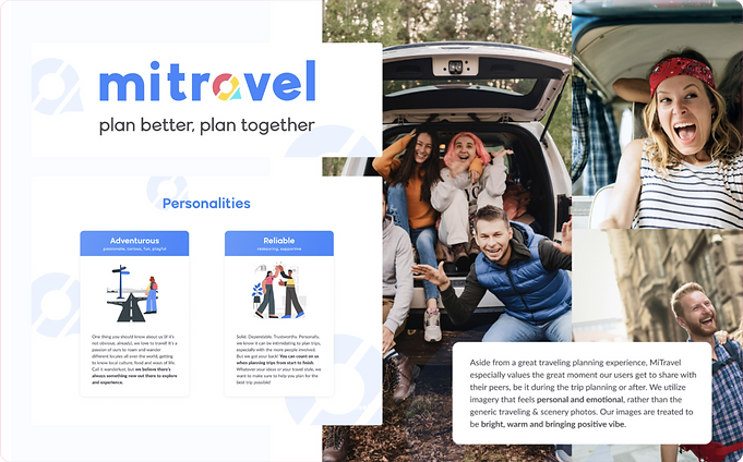
Our visual identity went through several exploration periods. With my team, I was leading the rebrand for the first time in 2020. Back then, as the MVP was the main focus, we just managed to quickly put together a new visual identity and a brand guideline. In 2022, we had the opportunity to revisit and refine the branding again as we opened up the primary target to young working professionals & students. One of our designers was taking the lead on creating the direction, while I was supervising and contributing to the brand vision.
Design system
Evolved for a memorable identity
Utilizing my teammate’s art direction, I put together a collection of assets and illustration works for the team. I also created a mascot and found ways to incorporate him into our marketing efforts.With the new direction, it is evident that we have achieved a more memorable identity and have become more approachable for our targeted customer groups. Our posts on social media are gaining more traction than ever before.

I was leading the team to create a compact design system for the platform in 2021 and was improving it constantly.

Feature
Planning Board
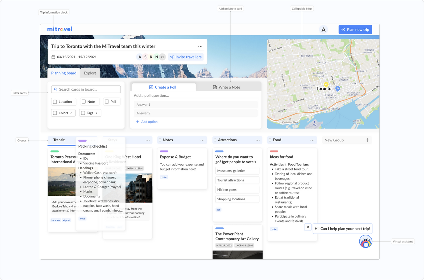
MiTravel Planning Board is one of our main features. It is a virtual board where users can invite their travel-mates to join in planning a trip together. For the first trip they ever create, we provide a template of categorizations for what they should be planning for. Users do not have to create an account to try out the Planning Board with us.
Feature
Explore Board
The Explore Tab is where users can research destinations they want to visit and add them directly to the Planning Board. User can use the map as a reference to pinpoint where their saved destinations and activities will be.

Feature
Community
The community feature is where the users can search, view, get inspired and reuse other members’ planning boards.

Mobile experience
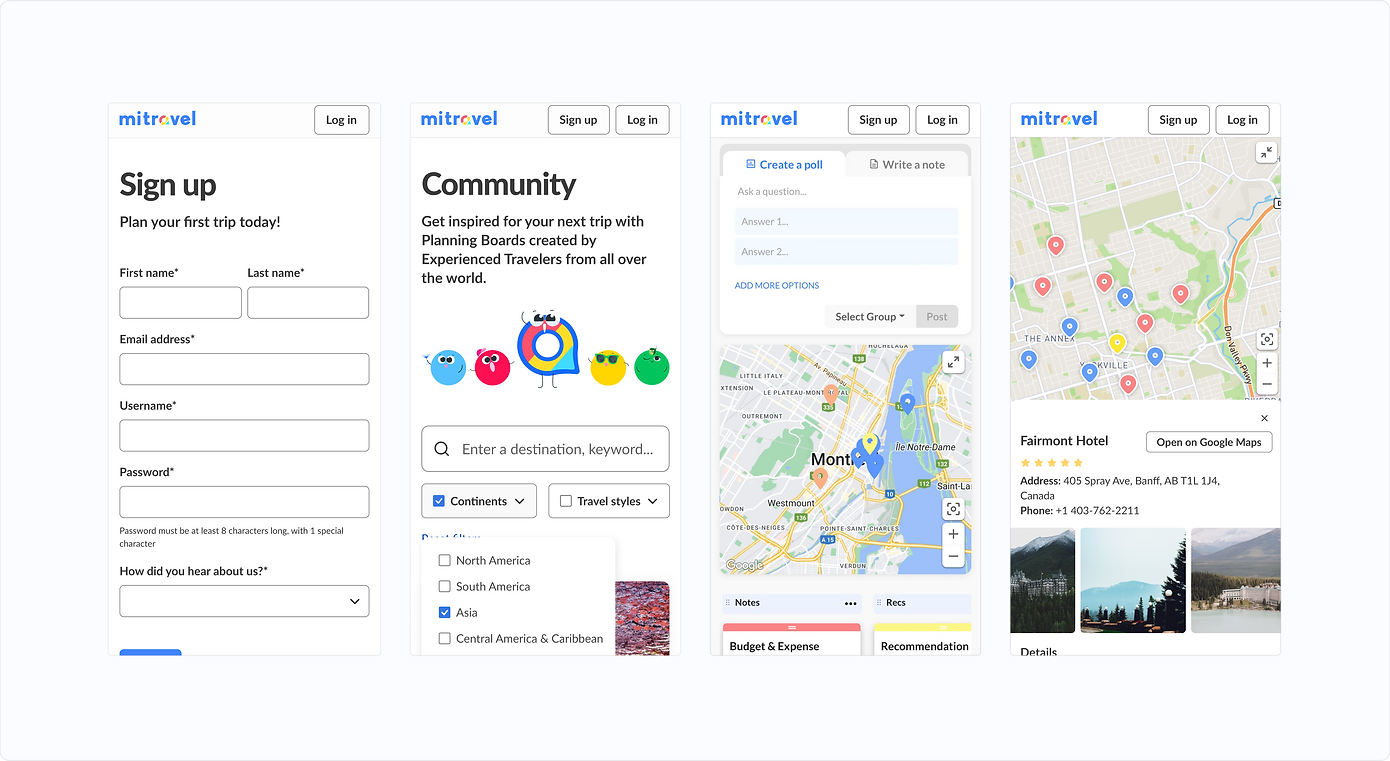
The entire platform is responsive and mobile-friendly.
Recap & learning
This experience has given me an opportunity to learn a lot of valuable skills, such as product strategy, project management, design, leadership, and collaboration. I treated this project as a sandbox where I was free to fail and learn from my mistakes.
We consistently worked on it together for 3 years, all remotely through the pandemic, and shaped it from a basic MVP into something desirable for our 1000+ active users before closing this venture to move on to other things.
Finally, I want to give a shout-out to my team: Annie & Rost, our mentors from New Venture BC: Beth & Nathaniel; from SFU Venture Connection: Lynn & Chris; and our interns.